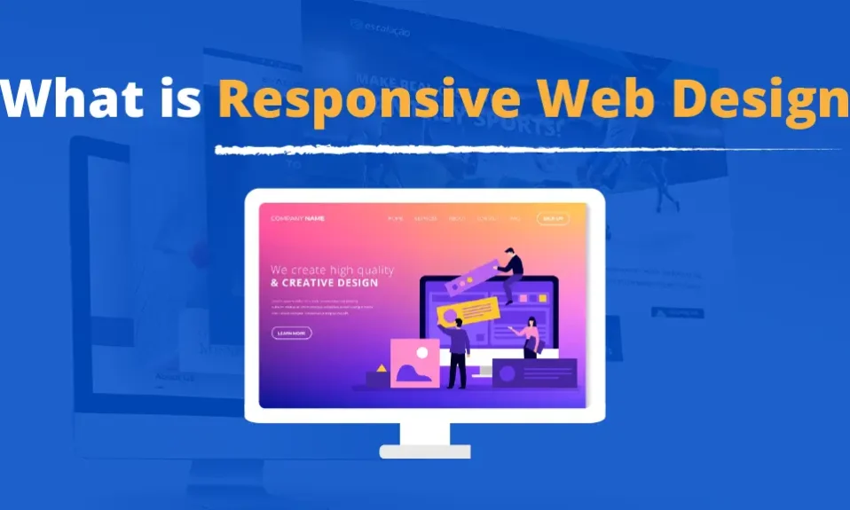
Welcome to our comprehensive guide on responsive web design, a game-changer in the digital world. As the number of internet users continues to grow, providing a seamless web browsing experience across various devices has become more crucial than ever.
Responsive web design ensures that your website adapts and responds to different screen sizes, resolutions, and orientations, making it a perfect fit for every device. Whether your visitors are using smartphones, tablets, laptops, or desktop computers, they will enjoy a consistent and user-friendly experience.
In this article, we will explore the fundamentals of responsive web design, including fluid grids, flexible layouts, and media queries that help create a visually appealing and functional website. We will also discuss the mobile-first approach, optimizing images and videos, touch-friendly navigation, performance optimization, accessibility considerations, and the SEO benefits of responsive design.
If you already have an existing website, don’t worry! We’ll provide guidance on integrating responsive design seamlessly into your current web presence. By the end of this guide, you’ll have a solid understanding of responsive web design and the tools and techniques needed to implement it effectively.
Key Takeaways:
- Responsive web design ensures a seamless browsing experience across devices.
- Fluid grids and flexible layouts are the fundamentals of responsive design.
- Media queries and breakpoints enable developers to apply device-specific styles.
- A mobile-first approach prioritizes content for mobile devices.
- Optimizing images, videos, navigation, and performance is crucial for responsive design.
The Fundamentals of Responsive Web Design
Responsive web design is an essential aspect of modern website development. It allows websites to adapt and provide an optimal user experience on various devices, including smartphones, tablets, and desktop computers. At the core of responsive design are two fundamental principles: fluid grids and flexible layouts.
Fluid Grids
Fluid grids are a key component of responsive design. They enable websites to have a flexible layout that adjusts based on different screen sizes and resolutions. In a fluid grid, the width of the elements is defined using percentages rather than fixed pixel counts. This ensures that the content stretches or shrinks proportionally to fit any device, creating a harmonious visual experience.
Let’s take a look at an example of a fluid grid:
| Screen Size | Grid Width | Number of Columns | Column Width |
|---|---|---|---|
| Large | 1200px | 12 | 100px |
| Medium | 992px | 12 | 83px |
| Small | 768px | 12 | 64px |
| Extra Small | 576px | 12 | 48px |
In the example above, the grid width and column widths adjust based on different screen sizes. This ensures that the layout remains consistent and visually appealing across devices.
Flexible Layouts
Flexible layouts complement fluid grids by allowing elements to adapt their size and position based on available screen space. This ensures that content is not crowded or distorted on screens of various sizes. Developers achieve flexibility by using relative units such as percentages, ems, or rems rather than fixed pixel measurements.
By combining fluid grids and flexible layouts, responsive web design creates a seamless, visually appealing experience for users on any device.
Media Queries and Breakpoints
Media queries and breakpoints are essential tools in responsive web design. They allow developers to create device-specific styles and adapt the content accordingly. By defining breakpoints, designers can set specific layout changes for different screen sizes, ensuring that the website displays optimally on a variety of devices.
Media queries enable the application of device-specific styles by checking the characteristics of the user’s device, such as screen width, height, orientation, and resolution. Based on these parameters, developers can apply customized CSS styles to ensure a seamless and visually appealing experience for users.
Using media queries and breakpoints, designers have precise control over how their websites appear at different screen sizes. It allows them to rearrange elements, resize images, and modify the overall layout to ensure optimal readability and functionality on various devices.
Media queries and breakpoints give developers the power to tailor the user experience to specific devices, creating an immersive browsing experience for users across a wide range of platforms.
Determining Breakpoints
When determining breakpoints, designers must consider the most common screen sizes and resolutions for the target audience. By analyzing user data and utilizing industry standards, developers can identify the breakpoints that will provide the best user experience.
It’s crucial to strike a balance between too many or too few breakpoints. Too many breakpoints can make coding and maintenance more complex, while too few can compromise the responsive nature of the website. Designers should aim for a design that adapts smoothly and effortlessly as the screen size changes.
Here is an example of a commonly used set of breakpoints:
| Device | Breakpoint |
|---|---|
| Mobile | 480px |
| Tablet | 768px |
| Laptop | 1024px |
| Desktop | 1200px |
These breakpoints can serve as a starting point for designing responsive websites, but ultimately, it’s important to consider the specific needs and behaviors of the target audience.
By utilizing media queries and breakpoints effectively, designers can create stunning and functional websites that seamlessly adapt to various devices, ensuring an optimal user experience on every screen size.
Mobile-First Approach
With the increasing prevalence of mobile devices, adopting a mobile-first approach has become essential for website design. This approach prioritizes delivering a seamless user experience on mobile devices, ensuring that content is easily accessible and optimized for smaller screens.
Designing for mobile-first offers several benefits, both for users and businesses. By focusing on mobile devices from the outset, you can prioritize essential content, eliminating clutter and creating a more streamlined experience. This streamlined approach can improve page load times and reduce bounce rates, leading to increased user engagement and higher conversion rates.
“Adopting a mobile-first approach allows designers to truly understand what is essential for users. By prioritizing content for the smallest screens, we can ensure that the most critical information is readily available, regardless of the device being used.”
Mobile-first design also aligns with Google’s “mobile-first indexing” approach, where the search engine primarily uses the mobile version of a website to rank and index pages. By prioritizing mobile optimization, you can improve your website’s visibility in search engine results pages (SERPs) and increase organic traffic.
To effectively implement a mobile-first approach, consider the following:
- Content Prioritization: Determine the most important content for mobile users and ensure it is easily accessible.
- Responsive Design: Create a responsive layout that automatically adapts to different screen sizes.
- Touch-Friendly Interactions: Implement touch-friendly navigation and interactions to enhance the mobile user experience.
- Performance Optimization: Optimize your website’s performance to ensure fast load times on mobile devices.
By embracing a mobile-first approach and prioritizing content for smaller screens, you can deliver a superior user experience and maximize the potential of mobile traffic.
Responsive Images and Videos
When it comes to creating a seamless browsing experience across devices, optimizing images and videos for different viewports is crucial. By making these media elements responsive, you ensure they load quickly, adapt to different screen sizes, and display properly on any device.
One technique for responsive images is the use of srcset and sizes attributes. With srcset, you can provide multiple versions of an image, each optimized for a specific device or resolution. The browser then selects the appropriate image based on the device’s capabilities and screen size. The sizes attribute helps the browser determine the appropriate image size to download.
Here’s an example:
<img src=”image.jpg” alt=”Description of the image” srcset=”small.jpg 320w, medium.jpg 800w, large.jpg 1200w” sizes=”(max-width: 600px) 100vw, (max-width: 1200px) 50vw, 33vw” />
For adaptive videos, you can use media queries to specify different video sources for different viewports. With this approach, you provide multiple video files optimized for various resolutions and devices. The browser then selects the appropriate video source based on the device’s capabilities and screen size. This ensures that the video plays smoothly and without buffering on any device.
Here’s an example:
<video>
<source src=”video.mp4″ type=”video/mp4″ media=”(max-width: 600px)”>
<source src=”video-hd.mp4″ type=”video/mp4″ media=”(min-width: 601px)”>
</video>
Loading Optimization
In addition to making images and videos responsive, it’s important to optimize their loading to further enhance performance. Here are a few tips:
- Compress your images: Use image compression techniques to reduce their file size without compromising quality. This helps reduce loading times for images across devices.
- Lazy loading: Implement lazy loading techniques to defer the loading of images and videos that are not immediately visible on the screen. This improves initial page load and saves bandwidth.
- Video streaming optimization: Consider using adaptive streaming technologies, such as HLS or DASH, to dynamically adjust the quality and resolution of the video based on the network conditions and device capabilities.
By implementing these techniques, you can ensure that your responsive images and videos deliver a visually engaging experience to users across all devices.
| Pros | Cons |
|---|---|
| Improved user experience | Potential increase in file size |
| Optimized loading times | May require additional development effort |
| Compatibility with different devices | Potential for compatibility issues in older browsers |
Touch-friendly Navigation
Navigation is a crucial element of user experience, especially for touch-enabled devices. Designing intuitive and touch-friendly navigation menus can greatly enhance a website’s usability. By providing an effortless way for users to browse through the content, touch-friendly navigation ensures a seamless and enjoyable mobile experience.
Best Practices for Touch-friendly Navigation
- Keep it simple: A clutter-free and easy-to-navigate menu is essential for touch-friendly navigation. Avoid overcrowding the screen with excessive menu items or complex dropdowns.
- Use large and spaced-out buttons: Buttons should be large enough to be easily tapped with a finger, allowing for accurate and comfortable navigation. Provide enough spacing between buttons to prevent accidental taps.
- Implement clear labeling: Use concise and descriptive labels for menu items to help users understand what to expect when they tap on them. Avoid ambiguous or cryptic labels that may confuse users.
- Implement touch gestures: Take advantage of touch gestures, such as swiping or sliding, to provide additional navigation options. This can enhance the user experience and make navigation more intuitive.
- Optimize for one-handed use: Consider how users will interact with the navigation menu using just one hand. Place important menu items within easy reach of the thumb to accommodate one-handed browsing.
- Use visual feedback: Provide visual feedback, such as highlighting or animation, when a menu item is tapped. This helps users understand and confirm their interaction, providing a more satisfying navigation experience.
By following these best practices, websites can ensure their navigation menus are touch-friendly and optimized for mobile devices. This, in turn, enhances the overall user experience and encourages visitors to engage with the content more seamlessly.
Performance Optimization
When it comes to responsive websites, performance optimization is key. Users expect websites to load quickly, regardless of the device they are using. Slow load speeds can lead to higher bounce rates, lower engagement, and decreased conversion rates. Therefore, it is crucial to implement various techniques to optimize the performance of your responsive website.
Minification
One technique for improving load speed is minification. Minification involves removing unnecessary characters from your website’s code, such as white spaces, line breaks, and comments. By reducing the code’s size, minification helps to minimize the time it takes for browsers to download and process the code. This results in faster load speeds and improved overall performance.
Caching
Caching is another powerful technique for enhancing performance. By enabling caching, you can store certain elements of your website, such as images, JavaScript, and CSS files, on the user’s device. This allows the browser to retrieve those cached elements locally instead of downloading them from the server every time the user visits the website. As a result, the website loads faster, reducing the load on the server and improving the user experience.
Optimizing Code
Optimizing your code is essential for responsive websites. This involves reducing the number of HTTP requests by combining multiple CSS and JavaScript files into one. Additionally, it’s important to optimize images by compressing them without compromising their quality. Large files can drastically slow down load speeds, so it’s necessary to find the right balance between image size and quality.
“Performance optimization is like fine-tuning a car engine – it ensures your website runs smoothly and efficiently, providing users with a seamless browsing experience.”
By implementing these performance optimization techniques, you can drastically improve the load speed of your responsive website, resulting in increased user satisfaction and engagement. Take the time to analyze and optimize your website’s performance, and you’ll reap the rewards in the form of improved conversions and a stronger online presence.
| Performance Optimization Techniques | Benefits |
|---|---|
| Minification | – Reduced code size – Faster load speeds |
| Caching | – Faster load speeds – Improved user experience |
| Optimizing Code | – Fewer HTTP requests – Faster load speeds |
Accessibility Considerations
When designing for the web, it is crucial to prioritize accessibility to ensure that everyone can access and navigate your content, regardless of any disabilities or limitations they may have. This includes making your responsive web design compatible with screen readers, providing proper alt text for images, and implementing other accessibility features.
Compatibility with Screen Readers
Screen readers are essential tools used by individuals with visual impairments to navigate websites and access content. Ensuring compatibility with screen readers allows these users to access and understand your website’s information effectively. When developing a responsive website, consider the following:
- Use semantic HTML markup to provide clear and meaningful structure to your content, making it easier for screen readers to interpret.
- Include descriptive text for interactive elements, such as buttons and links, to provide context and guidance to screen reader users.
- Avoid using elements that may cause confusion or hinder accessibility, such as non-standard form controls or complex navigation menus.
Proper Alt Text for Images
Images play a vital role in web design, but they can be inaccessible to individuals with visual impairments. By providing proper alt text for images, you can ensure that screen readers can convey their meaning to users who cannot see them. When writing alt text:
Be descriptive and concise, conveying the purpose and context of the image without being overly verbose.
Include essential details, such as the subject, relevant action, and any relevant text within the image.
Other Accessibility Features
In addition to screen reader compatibility and alt text for images, there are other accessibility features you can implement in your responsive web design:
- Ensure color contrast between text and background to make it easier for users with visual impairments to read the content.
- Provide captioning or transcripts for videos to accommodate individuals with hearing impairments.
- Make sure that interactive elements are accessible via keyboard navigation for users who cannot use a mouse.
By taking these accessibility considerations into account during the development of your responsive web design, you can create a more inclusive and user-friendly experience for all visitors.
| Web Accessibility Guidelines | Importance |
|---|---|
| WCAG 2.1 (Web Content Accessibility Guidelines) | Provides comprehensive guidelines and success criteria for making web content accessible to individuals with disabilities. |
| Section 508 | Defines the accessibility standards for federal electronic and information technology (EIT) used by the U.S. government. |
| ARIA (Accessible Rich Internet Applications) | Defines a set of attributes that can be used to enhance the accessibility of web applications. |
SEO Benefits of Responsive Design
Responsive design is not only essential for seamless web browsing across devices, but it also offers significant SEO benefits, improving search engine rankings and increasing organic traffic. Let’s explore how responsive websites positively impact SEO:
1. Enhanced User Experience
Responsive design ensures that your website provides a consistent and user-friendly experience across all devices. With easy navigation, readable content, and optimized images, users are more likely to stay engaged and spend more time on your site. This improves user metrics like bounce rate and dwell time, which are significant factors considered by search engines when ranking websites.
2. Mobile-Friendliness
Google’s mobile-first indexing prioritizes mobile-friendly websites, as the majority of web searches are now conducted on mobile devices. A responsive design ensures your site renders correctly on smartphones and tablets, increasing its chances of appearing in mobile search results. Mobile-friendly websites also improve user satisfaction and reduce the likelihood of visitors bouncing back to search results.
3. Avoid Duplicate Content Issues
When you have separate desktop and mobile versions of your website, it can lead to issues with duplicate content. Search engines may perceive this as duplicate content and penalize your site’s rankings. With responsive design, you have a single URL and consistent content across all devices, eliminating duplicate content concerns and improving your SEO efforts.
4. Faster Page Load Times
Page speed is a crucial ranking factor, and responsive design can significantly optimize load times. By adapting the website’s layout and content to fit different screen sizes, responsive design eliminates the need for separate mobile site redirects. This results in faster page load times, providing a better user experience and positively impacting search engine rankings.
5. Improved Social Sharing
Responsive design ensures that your website is easily shareable on social media platforms across devices. Users can share and access your content seamlessly, which can lead to increased visibility, engagement, and backlinks. When your content reaches a wider audience, it can contribute to improved search engine rankings.
“A responsive website not only provides a better user experience but also offers significant SEO benefits. By optimizing various elements like user experience, mobile-friendliness, and page load times, responsive design helps websites rank higher in search engine results, driving more organic traffic.”
In conclusion, embracing responsive design is crucial for both user experience and search engine rankings. By ensuring a seamless browsing experience, mobile-friendliness, and fast page load times, responsive websites can enhance SEO efforts and attract more organic traffic.
Testing and Debugging
Testing and debugging are crucial steps in the development process of responsive design. They ensure that the website functions smoothly and provides an optimal user experience across different devices. In this section, we will explore various tools and techniques that can be used for testing and debugging responsive design.
Emulators and Simulators
Emulators and simulators are valuable tools for testing the responsiveness of a website. These tools simulate different devices and screen resolutions, allowing developers to see how the website will appear and function on various platforms. By testing the website on different emulated devices, developers can identify and rectify any design or layout issues.
Popular emulators and simulators include:
- Google Chrome Developer Tools: This integrated development environment (IDE) provides a range of device emulators, allowing developers to test and debug responsive websites on different screen sizes and resolutions.
- BrowserStack: This cloud-based testing platform offers emulators and simulators for a wide range of devices and browsers, enabling developers to test responsive designs across multiple configurations.
- Sauce Labs: Another cloud-based testing platform that provides emulators and simulators for various devices and browsers, allowing developers to test their responsive designs extensively.
Responsive Design Validators
Validators are tools that help identify issues in a website’s markup and code. They can be particularly useful for detecting problems related to responsive design. By running a responsive design validation tool, developers can identify any errors or inconsistencies in their implementation.
Some popular responsive design validators include:
- W3C Markup Validation Service: This online tool checks the markup validity of web documents and provides insights into the structure and syntax of a website’s code.
- Google Mobile-Friendly Test: This tool analyzes a website’s mobile-friendliness and provides recommendations for improvement.
- GTMetrix: In addition to performance analysis, GTMetrix offers a responsive design testing feature that evaluates a website’s responsiveness and detects any issues that may hinder its functionality.
Testing and debugging are vital for ensuring a responsive web design that works seamlessly across devices. By utilizing emulators, simulators, and validators, developers can identify and resolve any design or functionality issues, resulting in a better user experience.
Integrating Responsive Design into Existing Websites
If you already have an existing website, retrofitting responsive design can be challenging. However, with the increasing importance of mobile-friendly websites and the need for a seamless user experience across devices, integrating responsive design is essential. In this section, we will provide guidance and best practices for successfully integrating responsive design into an established website.
Assessing Your Current Website
Before diving into the process of integrating responsive design, it’s important to assess your current website. Look for any design elements, like fixed-width layouts or non-responsive media, that may hinder the implementation of responsive design. Identify areas where content may need to be restructured or optimized to fit different screen sizes and resolutions.
Consider conducting a thorough website audit to identify potential challenges and areas of improvement. This audit can help you prioritize which aspects of your website need immediate attention during the integration process.
Planning the Integration Process
Once you have assessed your website, it’s crucial to create a detailed plan for integrating responsive design. Outline the specific goals and objectives you want to achieve with the integration. Consider the target devices and screen sizes you want to optimize your website for, as this will help determine the breakpoints and media queries you need to implement.
Based on your assessment and goals, you can create a roadmap that outlines the different steps and milestones of the integration process. This roadmap will serve as a guide throughout the implementation, ensuring a systematic and organized approach.
Adapting the Layout and Design
One of the key aspects of integrating responsive design is adapting the layout and design of your website to be flexible and fluid. This includes converting fixed-width layouts to fluid grids and using percentage-based measurements to ensure elements resize correctly on different devices.
Consider prioritizing content based on its importance and relevance, and be prepared to make decisions about what elements should be visible on smaller screens. Create a visual hierarchy that guides users through the content smoothly, regardless of the device they are using.
Optimizing Media and Images
Different devices require different versions of media files and images to ensure optimal performance. Optimize your images by using responsive image techniques, such as using CSS to serve appropriately sized images based on the viewport dimensions.
It’s important to strike a balance between image quality and file size to ensure quick loading times and efficient data usage. Test and optimize media assets for a range of devices and resolutions to deliver the best possible user experience.
Testing and Iteration
Throughout the integration process, testing is crucial to ensure that your website functions flawlessly across different devices and screen sizes. Test on various mobile devices, tablets, and desktop browsers to identify any issues or inconsistencies that need to be addressed.
Iterate and refine your design based on user feedback and analytics data. Monitor the performance metrics of your responsive design, such as page load times and user engagement, to continuously optimize and enhance the browsing experience.
By following these best practices and paying attention to the specific needs of your existing website, you can successfully integrate responsive design and ensure a seamless user experience across all devices.
Conclusion
Responsive web design is an essential approach in today’s dynamic technological landscape. By seamlessly adapting to different devices, it ensures a consistent and enjoyable browsing experience for users. Whether they are using a desktop computer, a tablet, or a smartphone, responsive design ensures that the website appears and functions perfectly, providing a perfect fit for every device.
In addition to enhancing user satisfaction, responsive design also improves accessibility. By considering the needs of all users, including those with visual impairments who rely on screen readers, responsive web design ensures that everyone can access and navigate the content easily. Proper implementation of alt text for images and other accessibility features further reinforces inclusivity.
Moreover, responsive design has significant benefits for search engine optimization (SEO). Search engines favor websites that provide a responsive experience, resulting in improved rankings and increased organic traffic. By embracing responsive design, businesses can stay ahead of the competition and reach a wider audience in the digital world.
In conclusion, responsive web design is a powerful tool that enhances user satisfaction, accessibility, and SEO rankings. Its ability to adapt to different devices ensures a seamless browsing experience, while its focus on inclusivity makes the web accessible to all. Embrace responsive design to build websites that excel in the ever-evolving digital landscape.
FAQ
What is responsive web design?
Responsive web design is an approach to designing and developing websites that ensures they adapt and respond seamlessly to different screen sizes and devices. It allows for a perfect fit and optimal browsing experience on every device, whether it’s a desktop computer, tablet, or mobile phone.
What are the benefits of responsive web design?
Responsive web design offers several benefits, including improved user experience, increased accessibility, and better search engine optimization. By providing a seamless browsing experience across devices, responsive design ensures that users can easily navigate and consume content on any screen, which leads to higher engagement and user satisfaction.
How does responsive web design work?
Responsive web design relies on fluid grids, flexible layouts, and media queries. Fluid grids and flexible layouts allow the website to adapt its structure and content based on the screen size, while media queries enable developers to apply specific styles and rules to different devices, ensuring optimal display and functionality.
Why is a mobile-first approach important in responsive web design?
With the increasing use of mobile devices, adopting a mobile-first approach in responsive web design has become crucial. By prioritizing the design and optimization for mobile devices, developers ensure that the website is accessible and functional for the majority of users. This approach helps streamline content, prioritize key information, and optimize performance for smaller screens.
How can I optimize images and videos for responsive design?
To optimize images for responsive design, you can use techniques such as responsive image breakpoints and lazy loading. Breakpoints allow you to specify different image sizes and resolutions for different screen sizes, ensuring optimal loading speed and display. For videos, adaptive streaming technologies like HTML5 video or adaptive bitrate streaming can be used to ensure smooth playback on different devices and internet connections.
What are the best practices for touch-friendly navigation in responsive design?
In responsive design, touch-friendly navigation is essential for a positive user experience on mobile devices. Some best practices for touch-friendly navigation include using large, easily tappable buttons, implementing clear and intuitive navigation menus, and avoiding complex drop-down menus or small links that may be difficult to tap accurately on touchscreens.
How can I optimize the performance of responsive websites?
Performance optimization is crucial for responsive websites to ensure fast loading times and a smooth browsing experience. Techniques such as minifying CSS and JavaScript files, leveraging browser caching, optimizing images, and reducing HTTP requests can significantly improve the performance of responsive websites.
What accessibility considerations should I keep in mind for responsive design?
When implementing responsive design, it is important to prioritize accessibility. This includes ensuring compatibility with screen readers, using proper alt text for images to provide alternative information, maintaining proper color contrast for readability, and implementing other accessibility features according to best practices and accessibility guidelines.
How can responsive design affect search engine optimization?
Responsive web design can have a positive impact on search engine optimization (SEO). Having a responsive website ensures that you have a single URL for all devices, which simplifies website management and avoids duplicate content issues. In addition, Google has stated that mobile-friendly websites are ranked higher in mobile search results, making responsive design beneficial for improving search engine rankings and increasing organic traffic.
What tools and techniques can I use to test and debug responsive design?
There are various tools and techniques available for testing and debugging responsive design. Emulators and simulators allow you to preview how your website behaves on different devices and screen sizes. Responsive design validators can help identify issues and errors in your responsive design implementation. Additionally, manual testing on real devices and using browser developer tools can provide insights into how your website adapts and performs in different contexts.
How can I integrate responsive design into an existing website?
Integrating responsive design into an existing website, also known as retrofitting, can be a complex process. It involves analyzing the existing structure and design, identifying areas that need modification, and implementing responsive design techniques such as fluid grids and media queries. It is recommended to consult with experienced web developers or seek professional assistance to ensure a smooth and successful integration.